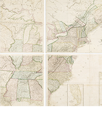
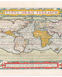
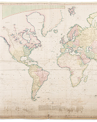
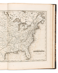
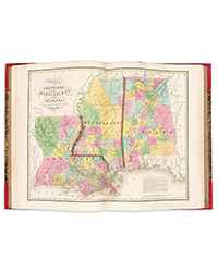
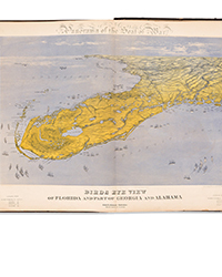
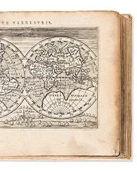
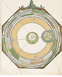
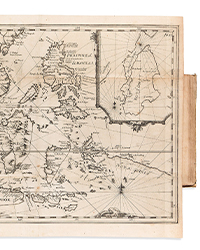
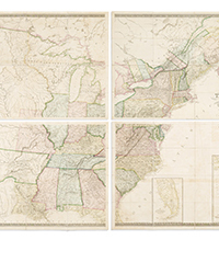
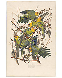
You can spend a lifetime learning the fine points of graphics, whether they are original works of art, or parts of books such as illustrations, maps or in some cases photos. I got my degree in printmaking, then knocked around the museum side of graphics for awhile before ending up as a bookseller for more than 40 years years. I can’t make you an instant expert (especially not in three minutes) put here are a few tips that may come in useful when handling images on paper.
TIPS
Touch It: When it comes to graphics “touch” is the most important and most accurate indicator. It is easy to fool the eye, copies are everywhere, and newer digital technology can easily replicate not just the image but the plate tone and even in some cases the plate mark. The eye is gullible, the fingers not so much. When in doubt touch it. Feel the surface of the paper, notice how the ink lies on the sheet (or sinks into the surface), notice the “feel” of the paper. Your fingers are a better judge of age than your eyes.
Paper is hard to forge: It’s easy to reproduce a picture, especially now in the 21st century there are countless ways to make and edit digital copies. Are you looking at an 18th century map, but the paper feels too slick, thin, brittle or modern for the image? Chances are it’s not the real thing. Don’t be fooled by fancy presentation, if you’ve got an old picture on a new paper your eye may not see it, but your fingers will know the difference.
Speaking of paper and touch, it’s easy to tell the difference between an antique “rag” paper and a modern “wood pulp” paper. Up until the middle of the 19th century almost all paper had significant rag (long strong fiber) content which made them feel and wear more like cloth than what we think of as “paper” today. An older rag pulp paper will be flexible and it may bend, but it usually doesn’t make a hard sharp crease or chip easily.
In the mid-19th century the wood pulp paper manufacturing process replaced rag papers except for cases where a fine a durable sheet was desired (and that wasn’t often). That’s why the old maps and engravings made in the 1700s are frequently found in such terrific shape, while their younger copies and counterparts from the late 19th century are often brittle and chipped.
Wood pulp papers can look terrific: they come in a huge range of weights, finishes and colors, but in the end the fibers that hold the sheet together are short and weak. Wood pulp papers often yellow, brown or fox (get age spots). They get brittle, tear easily, and not made to last. Most fine prints are still made on rag papers. As for conservation supplies, even with our current push toward archival interleaving, chances are you can retard discoloration with careful handling, but not entirely stop it.
Don’t buy framed artwork on paper under glass without taking it out of the frame- that goes for anything on paper and it is the main corollary to “Touch It.” If it’s under glass you have at least a very good chance of being wrong. If you are thinking about buying a framed print or map on paper under glass, no matter how real and authentic it appears, take it out of the frame. Take it out of the mat. Turn it over and look on the back. Take it off of the backing and hold it up to the light, look for watermarks, ghost images, other things you might not see otherwise.
Many graphics have wonderful frames attached to ghastly acid saturated mats that are burning and eating away at the paper below them. Ditto for backing boards. Even the modern so called “acid free” or buffered matting leaves mat burn, a yellowish ghosting at the edge of the image area. If you are going to spend serious money, take the time to know what you are getting. As for storage, remember even old ink can offset, so store your print inventory flat in a cool dry place, interleaved with acid free paper and check frequently for insects.
Read any simple book on printmaking. Can’t tell a lithograph from a silk screen? Don’t know an etching from an engraving? Take the time to read an easy inexpensive book. The one I recommend is called THE HISTORY OF PRINTMAKING; it’s part of the Scholastic Voyages of Discovery series published in 1996. It’s actually made for children, but it’s clearly written and vividly illustrated. You can read it cover-to-cover in less than an hour and learn a tremendous amount of basic information about graphic arts. Currently there are many copies available online priced under $10.
Don’t hang your prints in the bathroom or direct sunlight. That advice seems like a no-brainer to me, but you’d be surprised how many people don’t realize that prints are both light and humidity sensitive.
TOOLS
Own a good magnifying glass. The magnifying glass is a friend of both the buyer and the seller. Graphics, especially the kind of graphics found in books are intimate in nature and usually relatively small in scale. Using a good magnifying glass can help a seller explain the differences in tonality, line quality and techniques. All of those things which are hard to explain in words are easy (nay exciting) to see and easily understood with the help of a good magnifying glass.
The magnifying glass is also indispensable for the buyer, as it can reveal the telltale tiny “dots” that are the hallmark of the photolithography (often called offset litho) process. Seeing those dots under the glass means “This is a modern printed reproduction. Even if it’s “old”, it’s an old repro.
A couple useful TERMS
Del. & Sculp. Del (or similar) means "drew" in Latin. The name following is the artist who did the drawing that the print reproduces. It is common, especially in the 18th and 19th century to see Del. followed by a name below the image on one side of the print (often on the left side below the image, and Sculp. (or similar)- meaning the name of the person or company that did the engraving) on the other side, usually the right, below the image.
A/P in contemporary printmaking A/P written in pencil below an image or on the back of the sheet means artist’s proof. An artist’s proof can be one of many stages that the image goes through before arriving at the final version, i.e. the image that will be used to make multiple copies. Artists often keep artist’s proofs for their own collections. An artist’s proof is likely to be scarcer than a similar print.
Numbering a print is a contemporary convention that has come into being relatively recently. If you see a fine “art” print that is numbered 2/250 that means it is the second print pulled in an edition limited to 250. It does not necessarily mean all 250 copies have been printed, it means the artist intends to print no more than that number. Numbering prints isn’t always accurate and it doesn’t invariably guarantee there aren’t other copies floating around as different states or proofs. Numbering originally was used because the plates would wear down and an early impression might be better than a later impression, in today’s world numbering is frequently more of a marketing technique than any guarantee of scarcity


![<b>Scandinavian Art & Rare Books Auctions, Dec. 4:</b> ROALD AMUNDSEN: «Sydpolen» [ The South Pole] 1912. First edition in jackets and publisher's slip case. <b>Scandinavian Art & Rare Books Auctions, Dec. 4:</b> ROALD AMUNDSEN: «Sydpolen» [ The South Pole] 1912. First edition in jackets and publisher's slip case.](https://ae-files.s3.amazonaws.com/AdvertisementPhotos/0a99416d-9c0f-4fa3-afdd-7532ca8a2b2c.jpg)
![<b>Scandinavian Art & Rare Books Auctions, Dec. 4:</b> AMUNDSEN & NANSEN: «Fram over Polhavet» [Farthest North] 1897. AMUNDSEN's COPY! <b>Scandinavian Art & Rare Books Auctions, Dec. 4:</b> AMUNDSEN & NANSEN: «Fram over Polhavet» [Farthest North] 1897. AMUNDSEN's COPY!](https://ae-files.s3.amazonaws.com/AdvertisementPhotos/a077b4a5-0477-4c47-9847-0158cf045843.jpg)
![<b>Scandinavian Art & Rare Books Auctions, Dec. 4:</b> ERNEST SHACKLETON [ed.]: «Aurora Australis» 1908. First edition. The NORWAY COPY. <b>Scandinavian Art & Rare Books Auctions, Dec. 4:</b> ERNEST SHACKLETON [ed.]: «Aurora Australis» 1908. First edition. The NORWAY COPY.](https://ae-files.s3.amazonaws.com/AdvertisementPhotos/6363a735-e622-4d0a-852e-07cef58eccbe.jpg)
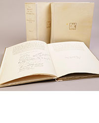
![<b>Scandinavian Art & Rare Books Auctions, Dec. 4:</b> SHACKLETON, BERNACCHI, CHERRY-GARRARD [ed.]: «The South Polar Times» I-III, 1902-1911. <b>Scandinavian Art & Rare Books Auctions, Dec. 4:</b> SHACKLETON, BERNACCHI, CHERRY-GARRARD [ed.]: «The South Polar Times» I-III, 1902-1911.](https://ae-files.s3.amazonaws.com/AdvertisementPhotos/3ee16d5b-a2ec-4c03-aeb6-aa3fcfec3a5e.jpg)
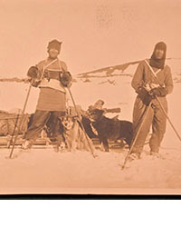
![<b>Scandinavian Art & Rare Books Auctions, Dec. 4:</b> [WILLEM BARENTSZ & HENRY HUDSON] - SAEGHMAN: «Verhael van de vier eerste schip-vaerden […]», 1663. <b>Scandinavian Art & Rare Books Auctions, Dec. 4:</b> [WILLEM BARENTSZ & HENRY HUDSON] - SAEGHMAN: «Verhael van de vier eerste schip-vaerden […]», 1663.](https://ae-files.s3.amazonaws.com/AdvertisementPhotos/d5f50485-7faa-423f-af0c-803b964dd2ba.jpg)
![<b>Scandinavian Art & Rare Books Auctions, Dec. 4:</b> TERRA NOVA EXPEDITION | LIEUTENANT HENRY ROBERTSON BOWERS: «At the South Pole.», Gelatin Silver Print. [10¾ x 15in. (27.2 x 38.1cm.) ]. <b>Scandinavian Art & Rare Books Auctions, Dec. 4:</b> TERRA NOVA EXPEDITION | LIEUTENANT HENRY ROBERTSON BOWERS: «At the South Pole.», Gelatin Silver Print. [10¾ x 15in. (27.2 x 38.1cm.) ].](https://ae-files.s3.amazonaws.com/AdvertisementPhotos/fb024365-7d7a-4510-9859-9d26b5c266cf.jpg)
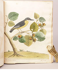
![<b>Scandinavian Art & Rare Books Auctions, Dec. 4:</b> PAUL GAIMARD: «Voyage de la Commision scientific du Nord, en Scandinavie, […]», c. 1842-46. ONLY HAND COLOURED COPY KNOWN WITH TWO ORIGINAL PAINTINGS BY BIARD. <b>Scandinavian Art & Rare Books Auctions, Dec. 4:</b> PAUL GAIMARD: «Voyage de la Commision scientific du Nord, en Scandinavie, […]», c. 1842-46. ONLY HAND COLOURED COPY KNOWN WITH TWO ORIGINAL PAINTINGS BY BIARD.](https://ae-files.s3.amazonaws.com/AdvertisementPhotos/a7c0eda0-9d8b-43ac-a504-58923308d5a4.jpg)
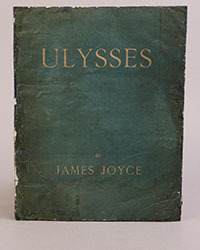
![<b>Sotheby’s, Dec. 11:</b> Darwin and Wallace. On the Tendency of Species to form Varieties..., [in:] <i>Journal of the Proceedings of the Linnean Society,</i> Vol. III, No. 9., 1858, Darwin announces the theory of natural selection. £100,000 to £150,000. <b>Sotheby’s, Dec. 11:</b> Darwin and Wallace. On the Tendency of Species to form Varieties..., [in:] <i>Journal of the Proceedings of the Linnean Society,</i> Vol. III, No. 9., 1858, Darwin announces the theory of natural selection. £100,000 to £150,000.](https://ae-files.s3.amazonaws.com/AdvertisementPhotos/00d5fd41-2542-4a80-b119-4886d4b9925f.png)
