Unless you’re a hard core Vienna enthusiast in love with the many kinds of art, architecture and design produced by the Wiener Werkstätte (WW) between 1903 and 1932, you might want to scroll past this story.
But if your eyes lit up reading the January 18th article by architectural critic Martin Filler in the New York Review of Books covering the recent WW exhibition at the Neue Gallery in New York, and if you were even more delighted when a copy of the catalog weighing a solid eight pounds actually arrived - well keep reading.
Though much has been written about the art and artists of the era, this 576 page book is a real tour de force - bringing together new and detailed scholarship (especially where the group’s finances are concerned), excellent photography and covering the entire range of the work.
The show itself was comprised of more than 400 objects including furniture, glassware, ceramics, metalwork, jewelry, wallpaper, fabrics, graphic design, book binding, textile, clothing and costume design, and on a larger scale all kinds of exhibit space and exceptional homes, gardens and interiors, mainly in Vienna. From the humble postcard to work on the grandest scale, Wiener Werkstätte did it all.
As Filler writes: “The Wiener Werkstätte (Viennese Workshops) was a direct offshoot of the Vienna Secession and the maverick faction of avant garde painters, sculptors and architects who in 1897 broke away from the conservative Association of Austrian Artists.” The book makes “the wholly convincing case for this brief efflorescence of incomparably exquisite high style design.” At its height the group employed more than 400 specialty fabricators and a staff of over 60.
This new volume documents the range and beauty of their creations in a comprehensive survey of the applied arts produced by the collective founded in Vienna by the architect Josef Hoffman, the artist Koloman Moser and the patron and collector Fritz Waerndorfer. (See Timeline at end)
They called their esthetic Gesamtkunstwerk (total work of art). The chapter on “Showrooms” contributed by Paul Asenbaum and Ernst Ploil describes the conceptual ideal as “the perfect processing and application of materials; handcrafted, high quality execution; functional modern design; and the integration of all individual aspects of the decor in an overall artistic master plan.”
“The intention of the Wiener Werkstätte was to introduce a particular lifestyle to the public and to demonstrate that an ‘everyday life’ designed by artists improves living standards and even enobles humankind.” Filler observes in the NYRB article, “Being able to control all aspects of a large commission had immense appeal-- because it produced “a more grounded sense of place and (at the same time looked) distinctively different from prevalent taste.”
Though it is common for art historians to wedge Vienna and its talented collective of architects, designers and artists in between Art Nouveau and Art Deco, its roots are really more in the Scottish wing of the Arts and Crafts movement with a strong nod to Charles Rennie MackIntosh, interpreted through a Viennese design sensibility and augmented by large, very large, extremely large budgets.
Now - a century later on, WW still resonates with refined and decorative design at all price points. Whether it’s the Klimt painting of Adele Bloch-Bauer sold to Leonard Lauder for $135 million in 2006 (at the time the most expensive painting ever sold) or a bevy of Klimt refrigerator magnets, Klimt inspired Barbie dolls, or WW inspired tea sets, there’s something for everyone in this genre. The unifying concept remains based on a simple grid and the endless variations that sprang from it, embellished with expensive and decorative surface detail. In its original incarnation it was all created with luxury materials and exceptional workmanship deluxe, elegant objects of desire from a set of flatware to a palace in Brussels.
According to Christian Witt-Dörling in the chapter on Palais Stoclet: “In April 1905 Waerndorfer congratulated Stoclet: ‘You will not believe how pleased Klimt is deep down with the idea of being able to do something powerful in a Hoffmann room, because you are the first since the Klinger exhibition who has given Klimt a commission for such a room and the first ever to ask not for a portrait or a painting one could purchase at an exhibition but something that is made for you, for your room designed by Hoffman.’”
The basic premise of their Gesamtkunstwerkis that the entire environment should be all of a piece and all the parts should be lovely, not just your house and garden, but your furniture, jewelry, wallpaper, textiles, leather goods, and most particularly, hand fabricated and ornately worked metal and stone. Werkstatte has no peer and at least at the beginning, price was no object.
For the best example on a grand scale think the Palais Socolet. in fact the chapter on the construction of that most luxurious mansion in Brussels where a Viennese banker was minding the family business and indulging a taste for the finer things of life documents in detail -- it could be expensive -- very expensive. And no matter how much they estimated, it always cost more, and after a while they stopped estimating and just scrambled for money.
The chapter on “Economics” is a real eye opener, or as Filler writes, …. “the Werkstätte was a money pit.” If the Palais Stoclet just sucked up the bucks, everything else they touched cost plenty too.
As the text makes amply clear, no matter who heads the design effort or how the finances were restructured through the years, WW never did get the hang of estimating. No matter what they estimated it was usually too low.
So that after a while WW stopped taking commissions at all. The Filler article gives the example of some unusual and complex candelabras proposed in connection with the Palais Stoclet. Quoting a letter from Hoffmann to Stoclet discussing the cost he writes…. "That alone is madness since it is simply impossible to produce a cost estimate for an object you haven't made yet.”
When an estimate is provided and the client says the cost is too high, Hoffmann is relieved… “and at that moment I already told her that we were freed of any obligation because she did not accept the estimate and that now we will not make the candelabras at any price because we no longer make unique objects.”
"Strange,” responds the client’s rep, “and we always thought we were getting extremely rich from these commissions.” This was distinctly not the case.
Though the primary focus of the book is on the men in their various roles, be it artistic or as underwriters and investors in the grand scheme of things, the women turn out to have had a large and important role as patrons, sitters for the paintings and as artists and designers in their own right as well.
Emilie Louise Flöge was Klimt’s companion for 30 years. Her talent shines in fashion, textiles, and clothing designs that are striking and beautiful and it goes without saying expensive. The chapter on ceramics also defines the role played by women, mostly students of Hoffman’s working in clay while the men were at war, and repeatedly, when the money gets tight it is often the women who prevail on the men to come up with the money to keep the venture alive.
What this book shows that others haven’t really explored is how much it cost and how they paid for it, which was always financially tight but on a scale of lavishness that is not to be believed. The book also has a chronology that shows all the different ways to fail, to restructure, to seek financial patronage to set sail again under plan B and to financially fail again.
The business side of the enterprise is more easily understood with this partial excerpt from the book’s chronology:
1899 Hoffmann does the Wittgenstein country house in Bergenhole. It’s the sister of the philosopher Wittgenstein who makes the introductions. A large and influential family, Paul Wittgenstein is a major patron and becomes an investor in 1914.
1902 Hoffmann is named artistic director of the 14th Secession exhibit, popularly known as the Beethoven Exhibition. Klimt completes a full length portrait of Emilie Flöge.
1903 The WW is founded by Hoffmann, Moser and Waerndorfer, with Waerndorfer providing the financial support.
1904 WW moves to larger quarters with space for bronze carpentry, gold, iron, jewelry, leather and silver in addition to a bookbindery, a painter’s studio and architectural office. There is also an office and showroom for objects sold there. Moser and Hoffmann design the interior of Flöge Sisters - an upmarket fashion salon.
Construction begins on the Sanatorium Purkersdorf, the first building conceived as a total work of art, a Hoffmann design to be carried out by WW.
en.wikipedia.org/wiki/Sanatorium_Purkersdorf
1905 Adolphe Stoclet commissions Hoffmann and WW to design what becomes the Palais Stoclet in Brussels, a monumental project. en.wikipedia.org/wiki/Stoclet_Palace
The artists grouped around Klimt, Hoffman, Moser and Moll leave the Secession because of artistic differences
1906 WW opens it own exhibition space.
More extravagant commissions from the Wittgenstein family and other wealthy, mostly Jewish-Viennese patrons follow. This is the year that dependence on the small group begins to have negative effects on financial situation. The directors begin to think of mass production. Such was not the case.
1907 WW begins producing postcards, their only foray into low end branding.
Moser leaves over financial dispute
Klimt completes his portrait of Adele Bloch-Bauer in the so called “Golden” style ornamented with real silver and gold.
Names of Oskar Kokoschka and Egon Schiele become more frequently associated with the WW group.
1911 Financial difficulties lead to the opening of a rescue company for WW in London, (despite the difficulties) WW expands to include textiles and fashion articles. Over the years the fashion division and textiles become one of the most successful part of WW enterprise.
1912 the Palais Stoclet has been under construction for 8 years.
1914 WW financial problems worsen. Waerndorfer loses almost his entire fortune supporting the WW. He is forced to leave the venture, moves to the US. Other backers recruited from Primavesi family.
Start World War I
1915 Banker Otto Primavesi assumes the role of managing director. Architect Dagobert Peche joins the group and over time becomes one of its most innovative designers.
1916 During the war female students from Hoffmann’s School of Applied Arts become a major factor in the ceramics department.
1918 WWI ends. Klimt, Moser, Schiele and Wagner die in Vienna.
1920 Another restructuring this time by architect Philipp Häusler. WW publishes its first catalog to reach more customers; it also does its first outsourcing. WW has 120 employees and 250 laborers in Vienna. WW has expanded beyond Vienna with showrooms in Berlin, Marienbad and Swiss locations.
1922 WW has 380 employees and 400 laborers
Joseph Urban opens a branch in NY
1925 Primavesi gives up his positions as managing director for financial reasons. His wife Eugenia becomes the main proprietor. The loss of one of its most important patrons and the generally poor financial situation forces the WW to lay off workers. Staff shrinks to 66 the smallest number since it was founded.
1926 WW restructures it debt.
1927 WW attempts to become an incorporated company. Kuno Grohmann, a nephew of Eugenia Primavesi, officially becomes a partial owner of WW.
1928 WW celebrates its 25th anniversary. Grohmann begins the restructuring of WW.
1929 World economic collapse.
1930 Alfred Hofmann and Georges Oeri take control and try to save WW despite desperate economic situation.
1932 WW files for bankruptcy, entire inventory auctioned off. WW finally closed.
While this book is comprehensive in scope and fascinating in detail, the massive size is a definite drawback. As a tool for the scholar or art enthusiast, it can charitably be described as a white elephant. It is cumbersome, bulky, unwieldy and difficult to read and handle.
While Ronald Lauder and his Neue Gallery has all the right instincts on the art and exhibit side, as a publishing venture it’s definitely the wrong format for the serious reader. Let’s hope some more savvy book people repackage and reprint this information in a multi-part smaller and more readable format.
That goes double for the typeface - whoever picked a thin sans serif in a small point size might have accomplished an aesthetic ideal, but it is next to impossible to read more than short passages.
The index is appalling, nearly 600 pages of dense information with a two page index. Shame.
Despite these very real shortcomings in the presentation, the information is all there and the photos are terrific -- but as a book itself - as a book -- is a real chore to handle and to read, not to mention to lift.
Because those who sponsored the project delivered the final product in such a clunky format, it is almost impossible to really get at the information: can’t read it in bed, can’t read on a desk, hard to prop it up, almost impossible to go back and forth from one part to another. So much good stuff and so frustrating in it’s presentation. Back to the drawing board on the publishing side.
Link to New York Review of Books article Jan 18, 2018 by Martin Filler:
www.nybooks.com/articles/2018/01/18/vienna-between-nouveau-and-deco


![<b>Scandinavian Art & Rare Books Auctions, Dec. 4:</b> ROALD AMUNDSEN: «Sydpolen» [ The South Pole] 1912. First edition in jackets and publisher's slip case. <b>Scandinavian Art & Rare Books Auctions, Dec. 4:</b> ROALD AMUNDSEN: «Sydpolen» [ The South Pole] 1912. First edition in jackets and publisher's slip case.](https://ae-files.s3.amazonaws.com/AdvertisementPhotos/0a99416d-9c0f-4fa3-afdd-7532ca8a2b2c.jpg)
![<b>Scandinavian Art & Rare Books Auctions, Dec. 4:</b> AMUNDSEN & NANSEN: «Fram over Polhavet» [Farthest North] 1897. AMUNDSEN's COPY! <b>Scandinavian Art & Rare Books Auctions, Dec. 4:</b> AMUNDSEN & NANSEN: «Fram over Polhavet» [Farthest North] 1897. AMUNDSEN's COPY!](https://ae-files.s3.amazonaws.com/AdvertisementPhotos/a077b4a5-0477-4c47-9847-0158cf045843.jpg)
![<b>Scandinavian Art & Rare Books Auctions, Dec. 4:</b> ERNEST SHACKLETON [ed.]: «Aurora Australis» 1908. First edition. The NORWAY COPY. <b>Scandinavian Art & Rare Books Auctions, Dec. 4:</b> ERNEST SHACKLETON [ed.]: «Aurora Australis» 1908. First edition. The NORWAY COPY.](https://ae-files.s3.amazonaws.com/AdvertisementPhotos/6363a735-e622-4d0a-852e-07cef58eccbe.jpg)
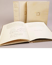
![<b>Scandinavian Art & Rare Books Auctions, Dec. 4:</b> SHACKLETON, BERNACCHI, CHERRY-GARRARD [ed.]: «The South Polar Times» I-III, 1902-1911. <b>Scandinavian Art & Rare Books Auctions, Dec. 4:</b> SHACKLETON, BERNACCHI, CHERRY-GARRARD [ed.]: «The South Polar Times» I-III, 1902-1911.](https://ae-files.s3.amazonaws.com/AdvertisementPhotos/3ee16d5b-a2ec-4c03-aeb6-aa3fcfec3a5e.jpg)
![<b>Scandinavian Art & Rare Books Auctions, Dec. 4:</b> [WILLEM BARENTSZ & HENRY HUDSON] - SAEGHMAN: «Verhael van de vier eerste schip-vaerden […]», 1663. <b>Scandinavian Art & Rare Books Auctions, Dec. 4:</b> [WILLEM BARENTSZ & HENRY HUDSON] - SAEGHMAN: «Verhael van de vier eerste schip-vaerden […]», 1663.](https://ae-files.s3.amazonaws.com/AdvertisementPhotos/d5f50485-7faa-423f-af0c-803b964dd2ba.jpg)
![<b>Scandinavian Art & Rare Books Auctions, Dec. 4:</b> TERRA NOVA EXPEDITION | LIEUTENANT HENRY ROBERTSON BOWERS: «At the South Pole.», Gelatin Silver Print. [10¾ x 15in. (27.2 x 38.1cm.) ]. <b>Scandinavian Art & Rare Books Auctions, Dec. 4:</b> TERRA NOVA EXPEDITION | LIEUTENANT HENRY ROBERTSON BOWERS: «At the South Pole.», Gelatin Silver Print. [10¾ x 15in. (27.2 x 38.1cm.) ].](https://ae-files.s3.amazonaws.com/AdvertisementPhotos/fb024365-7d7a-4510-9859-9d26b5c266cf.jpg)
![<b>Scandinavian Art & Rare Books Auctions, Dec. 4:</b> PAUL GAIMARD: «Voyage de la Commision scientific du Nord, en Scandinavie, […]», c. 1842-46. ONLY HAND COLOURED COPY KNOWN WITH TWO ORIGINAL PAINTINGS BY BIARD. <b>Scandinavian Art & Rare Books Auctions, Dec. 4:</b> PAUL GAIMARD: «Voyage de la Commision scientific du Nord, en Scandinavie, […]», c. 1842-46. ONLY HAND COLOURED COPY KNOWN WITH TWO ORIGINAL PAINTINGS BY BIARD.](https://ae-files.s3.amazonaws.com/AdvertisementPhotos/a7c0eda0-9d8b-43ac-a504-58923308d5a4.jpg)
![<b>Sotheby’s, Dec. 11:</b> Darwin and Wallace. On the Tendency of Species to form Varieties..., [in:] <i>Journal of the Proceedings of the Linnean Society,</i> Vol. III, No. 9., 1858, Darwin announces the theory of natural selection. £100,000 to £150,000. <b>Sotheby’s, Dec. 11:</b> Darwin and Wallace. On the Tendency of Species to form Varieties..., [in:] <i>Journal of the Proceedings of the Linnean Society,</i> Vol. III, No. 9., 1858, Darwin announces the theory of natural selection. £100,000 to £150,000.](https://ae-files.s3.amazonaws.com/AdvertisementPhotos/00d5fd41-2542-4a80-b119-4886d4b9925f.png)

